Archive for the ‘data visualized’ Category

Airport Trains Suck. Will REM Too?

Thursday, May 26th, 2016

The Caisse’s REM proposal has given Montrealers hope to finally have a rail connection to the airport.

The problem with rail connectors to airports, however, is that they are generally not a very good use of money: they are often expensive and have low ridership. Airport connectors underperform.

Don’t get me wrong, I like the idea of taking a metro home from the airport. I think most people would love that too, which is why everyone is so excited about it. But even if everyone will use it at some point or another, most only go to the airport once or twice a year. Thus, on any given day, not many people will use it. And that means low ridership.

Comparison with airport connectors in other cities

How many people would use the new proposed airport connector? In their marketing material, the Caisse claims 10,000 people will use it every day. But they have refused to provide their ridership study to back up that claim.

Given that the airport express bus is currently used by about 3,000 people per day, is this increase in transit ridership credible? Or are they being overly optimistic?

Since the Caisse is not releasing their numbers, I made my own “study”. Using a simple model, I have compared the ridership of North American airports with rail connections, to see what ridership could be like in Montreal. The assumption is that the proportion of people taking transit vs cabs or cars is similar across different airports. So if Montreal Trudeau is three times smaller than New York’s JFK, then the ridership of its transit line should be three times smaller as well.

To make results comparable to Montreal, the model includes airports with the following characteristics:

  • they must be in North America, to have a similar relative use of cars and transit
  • the rail connection must be the only major transit connection to the airport
  • the rail connection must be frequent (every 15 minutes or better)
  • the rail connection must provide a reasonable connection into town

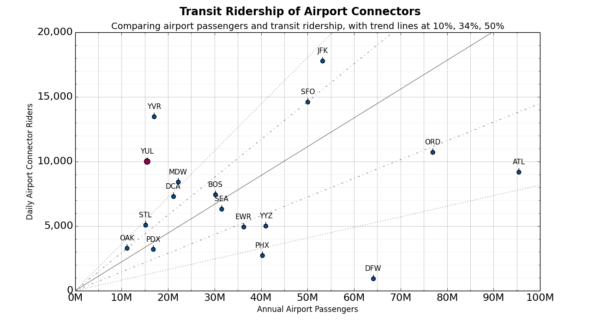
The scatterplot below shows daily ridership of the rail connector vs annual number of passengers through the airport (data). Airports in the upper left have a lot of transit ridership relative to their size, and airports in the bottom right are doing really badly. Note that large hub airports airports will be under-represented using this heuristic, because more passengers transfer to other flights at the airport.

airport-connector-comparison

We see, first of all, that some airport connectors really do suck. In a whole day, they could barely fill a couple of trains. Most airport other connectors do ok, and bring in about 3K to 5K riders for every 15M airport passengers per year (i.e. the size of Montreal’s airport).

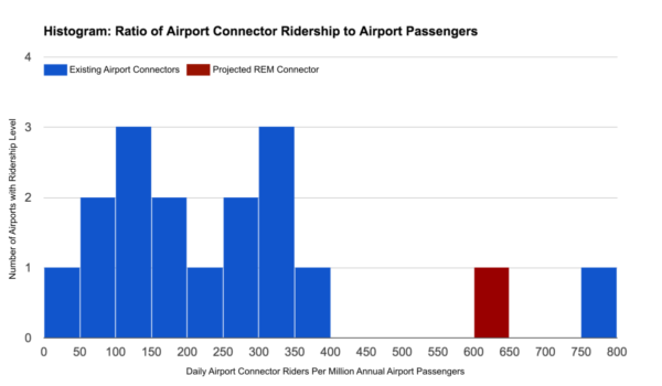
One airport does exceptionally well, and that’s Vancouver’s Canada Line. But it really is an outlier. It seems that the Caisse wants to create another such outlier with the REM, way beyond the 90% percentile. The ridership relative the total number of airport passengers for those two lines would be really far away from all other North American Airport connectors:

histogram of airport passengers vs rail connector ridership

On the whole, their 10K estimate is not entirely outrageous, but leans on the optimistic side. Maybe a more conservative estimate (but still assuming we can do better than the average because transit use is generally higher in Montreal), would be 5,000 to 6,000 riders per day. Definitely one should be concerned that the Caisse is using too optimistic projections.

Lessons From Toronto

One airport-connector project that turned out to have overly optimistic projections is the Union Pearson Express in Toronto.

The Express was initially sold to the public with a projected ridership of 8,000/day during the opening year. After construction started, the number was revised down to 5,000 after the first year and only reaching 7,500/day by 2025!

And once it was built, the ridership was actually declining after a lethargic start, down to about 2,200 raiders per day, as most people were put off by the $27.50 fare. At that point the fare was slashed to $12 and ridership quickly increased to be in line with projections (~5000/day).

The Pearson Express was built at a cost of 456 million dollars. In absolute terms, this is pretty cheap for a transit line, and was made possible by running most of the Pearson Express on existing commuter rail tracks. However, considering that only 5000 people use it every day, that’s a cost of $91,200 per daily rider. In terms of cost/benefit, that turns out to be very expensive compared to other transit lines:

construction cost
(adjusted to 2013$)
weekday ridership
cost/rider
O-Train (lrt) 27M$ 14K 1901$
C-Train (lrt) 582M$ 187K 3110$
Edmonton lrt 404M$ 70K 5774$
Pie-IX Busway (brt) 316M$ 70K 4514$
Laval Extension (metro) 829M$ 60K 13825$
Canada Line (light metro) 2100M$ 135K 15441$
Spadina Extension (metro) 2400M$ 100K 24000$
Pearson Express (heavy rail) 456M$ 5K 91200$

Transit lines can have hundreds of thousands of users per day. In general, a line that can only accumulate 5000 to 10,000 thousand people per day is not really worth building as rapid transit. In fact, if such a line weren’t an airport connection, most would consider that it only deserves a frequent bus line, or maybe a streetcar.

Comparing to the Metro

To put this in perspective, at 10K riders per day, the REM airport station would be equivalent to the 57th busiest station of the Montreal Metro, out of 68 stations in total. At 5K riders, it would be on par with Georges-Vanier as the second least used station of the system.

Of course, when you build a Metro line, it makes sense to add stations along the way even if their ridership won’t be that great. But would it make sense to build several kilometers of metro just to reach Georges-Vanier? I think not.

Conclusion & Questions

What we see from all this is that airport connectors, even successful ones, may only attract very few riders per day relative to their cost. We shouldn’t spend a billion dollars to help 5000 people, because on another project, those billion dollars could help 50,000 people.

If we do build an airport connector, it should be as part of a transit project whose main utility is not based on the airport connection. Basically, transit lines should be useful to as many people as possible, and an airport connection can be added if the marginal cost increase is relatively small.

The REM appears, at first glance, to do exactly that. But I still wonder, if I start to dig deeper, will the connection that is made to the airport make sense? Will it be cheap enough to justify building a rapid transit line to a terminus promising such low ridership? Is the airport connection that’s included in the REM project an efficient use of money? Is there a way to be more cost-effective? Is it a good use of public money?
The New Yorker: Income Inequality Visualized along New York’s Subway

Wednesday, April 17th, 2013

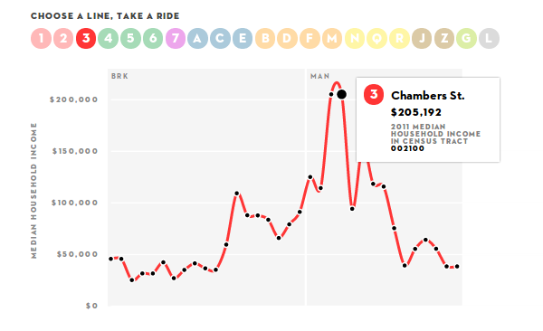
The New Yorker just released this nifty visualization, showing the median household income near New York Subway stations. It’s interactive, letting you click through the system’s lines, showing the the numbers for every stop. The accompanying article explains it as a way to show how the United States, and in particular New York City, has a problem with income inequality:

(…) if the borough of Manhattan were a country, the income gap between the richest twenty per cent and the poorest twenty per cent would be on par with countries like Sierra Leone, Namibia, and Lesotho.

Looking at it from more of a transit angle, for Benjamin Kabak at the 2nd Avenue Sagas the infographic presents a visual case against zone fares. New York’s very large subway system is under a single fare zone, from end to end you can travel more than 50km on a single ride ticket. That would seem unusual from a European point of view, where transit is viewed as something that ideally pays for itself, and distance-based fares are used to bring fares closer in line with the actual cost.

But in New York, as we can see from the interactive infographic, the median household income drops off rapidly as we go away from the center. So distance based fares would disproportionally affect less affluent people, who travel long distances to get to work in the city center, while more affluent people live nearby and only have short rides. The single fare zone is thus seen as a tool in helping the reduce or at least alleviate the income gap problem.

Looking at it from a more urban development perspective, I find the apparent concentration of income brackets problematic. Both concentrating poverty and concentrating wealth are bad for the city, its health, economic activity and liveliness. The city may not be able to improve the wealth distribution of its citizens by much (upper levels of government are generally more effective for that), but maybe it can find more ways to better integrate people of different income levels, give less affluent people access to more neighborhoods and promote mixed-income neighborhoods.

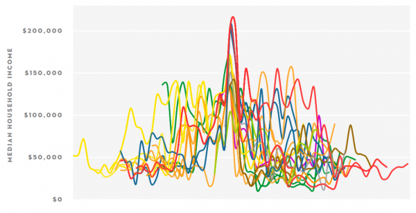
Either way, I was interested to get a better overview of all the data, instead of having to click through the lines one by one. So I went into the code that generates the infographic, and hacked at it a bit to get all of the lines shown on a single graph. All lines are aligned in the center with their wealthiest stop, which also approximately aligns them at the center of the city. The graph goes left to right, generally from Brooklyn/Queens via Manhattan to Bronx/Queens. By showing all the data on a single graph, the problematic distribution of wealth can be seen in a single view:

newYorkerSubwayIneqaulityOverview

Walksheds Visualized
Showing Populations near Montreal Rail Stations

Wednesday, April 3rd, 2013

walksheds are the area around a particular point of interest from where people are willing to walk to said point of interest. This point of interest is often a transit station, and the walkshed gives an idea how many people will reach the station on foot. While the walkshed depends on how walkable the area is, whether there are barriers like freeways, the geometry of the street grid, and how attractive the transit station is (people are willing to walk further to metros compared to bus stops), The area is often simplified as a circle around the transit station.

Montreal

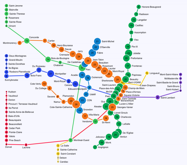
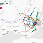
Montreal rail station walksheds – population within 800m of stations. The sizes of the circles and the numbers inside them correspond to the population in 1000 people

How much population lives within the walkshed gives an indication on the ridership of the transit line, the more people live in it – the more ridership can be expected. The corollary is that you want as much population within walksheds as possible.

If there are more people near the transit station, it reduces the reliance on feeder buses and park’n’rides (a reduction in park’n’rides also means more land within the walksheds is available for development). This will reduce both the cost of transportation services that have to be offered, and will increases the chances that people use transit – which will reduce the cost of required infrastructure like roads and parking spots, but will also decrease the burden on the environment.

The above visualization shows the population within 800m (1/2mile) of Montreal transit stations. This is considered a reasonable distance that people are willing to walk to a rail station. Picking this distance for all stations makes the comparison between stations easier, even if the actual walksheds may be different depending on how walkable the areas are. Also, a circle with 800m radius has about 2 square km of area, so by dividing the number by two, we get the population density (in people per square km).

In the image, we can see that many metro stations have more than 20 thousand people living near them, corresponding to more than 10 thousend people per square km. Compare that to the a density of 3.7K people/km² for the whole island of Montreal, 7.7 people/km² for the borough of Côte-des-Neiges–Notre-Dame-de-Grâcee, and 12.3K people/km² for the Plateau. The highest population is near station Cote-Ste-Catherine, the 2nd most populous is Mont-Royal, then Guy-Concordia (which also includes the most densest spot in Montreal).

We see that the commuter rail stations generally don’t have many people living near them, especially off the island. Some stations are directly next to highways, others are surrounded by a sea of parking, others are in the middle of nowhere. There is quite a deficit in Transit Oriented Development near many of the commuter rail stations, a missed opportunity. In many places, development would be a better use of station-adjacent land, compared to parking lots, or very low density development.

The most populous commuter rail stations outside of the inner city are on the Deux-Montagnes line, at least up to Roxboro – the Deux Montagnes line is the the only electrified line, has the most trains, and by far the most ridership. Some of the stations rival metro stations in terms of population density. Other populous stations are on the Blainville line, at least up to de la Concorde – it would seem that this stretch could also be a candidate for electrification, possibly more infill stations and much more frequent service (incidentally that would also help relieve congestion on the orange line).

What is interesting is that some metro stations have surprisingly little population near them. The missed development opportunities may not just exist near the commuter rail stations, but near the metro network itself. While some of those metro stations are also directly next to highways (like de la Savane) and have limited development opportunities, others are in very suburban looking areas that could probably be densified (like Assomption).

The data was created using the Canadian census data (from 2011), the gtfs for the STM and AMT was used to find the station locations. And a disclaimer: the stations are considered completely independently; so population of very close stations may be “counted” more than once.

Montreal Frequent Service Map – Update

Thursday, February 14th, 2013

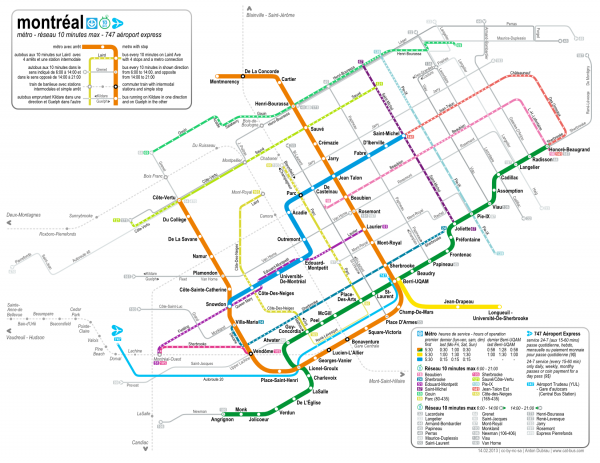
MontrealFrequentService150

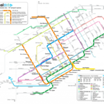
This has been a long time coming, I’ve finally gotten around to update my Montreal Frequent Service Map. This is a map of the Montreal Metro and the whole 10-Minute Max Network. There haven’t been many changes:

  • The 211 Lakeshore is not a 10 minute bus any more. The STM chose instead to create a network of West Island express buses. Some of these follow approximately the route of the 211, so many of the stops along that route may actually see frequent service to Metro Lionel-Groulx every 10 minutes. But the routes are not exactly the same, and the mess of that all is against the spirit of a frequent service map.
  • The 132 Viau is now the 136 Viau.
  • The daily pass needed to use the 747 airport express now costs 9$.

I also took the opportunity to enlarge the West Island, and improve the proportions west of the Orange line, and added the missing LaSalle commuter rail station. I again made a 600 dpi version, which can be found here, and a pdf.